Photographer: Amit Gosher
On our first visit we arrived at a ground-level apartment in Shikun Dan, Tel Aviv, to meet the family: two parents, a daughter and a son. A proverbial pink elephant in the room was hard to ignore: the long, oblique wall in the apartment. Along the wall, a string of rooms makes for a dark home, separating the family members from one another as they engage in various activities throughout the day.

Original Plan

XS Plan
Organizing Elements: A Diagonal Transformer and a Turquoise Box
As architects, we sometimes have a tendency to pick ready-made rooms "off the shelf": kitchen cabinets, furniture for bedrooms and home offices, and the likes.
Our projects offer an opportunity to design furniture that is tailored to the size, needs, and functions of each space.

Organizing Element [1]: The Transformer
Despite its size, it has a light feel thanks to its thin metal feet. On the inside, many functions, such as play space, pantry, laundry room, table, entryway mirror, and even the air conditioning system are arranged harmoniously.
Harnessing the Diagonal Transformer to Serve Home Activities
We love cooking while we entertain, watch TV with the kids playing and drawing nearby, fold laundry while chatting with each other. The apartment's original layout didn't allow for this simultaneous-activity fun to take place. Perpendicular walls "collided" with the oblique wall, creating a row of separate rooms. In order to solve the tension between the perpendicular walls and the oblique system we set them apart and used the oblique element to our benefit by creating an organizing element (XS Language) alongside it:
The white, Transformer-like unit brings together the different spaces and activities taking place in the home, creating well-defined spaces while allowing easy passage from one space to the next.

This Is a Home, Not a Showroom
The kitchen is conventionally thought of as an adult space. But ultimately, the kids enjoy playing near their parents, so why not go with it?
We integrated the designated play area into the Transformer and placed it close to the kitchen. The game shelves are fixed at the kids' eye level, so that their games are accessible to them, offering them both independence and responsibility (by selecting their own game on one hand, and putting it back in place when they're done on the other hand), in line with the principles of their Montessori education.
Designated Spaces Instead of Rooms
People like breaking apartments down into rooms, naming them "bedroom", "living room", or "laundry room" (the "grocery list" in XS Language). When we first approach the planning work, we try to break down the residents' daily routines, and then to divide the home based on the activities taking place within: a place to sleep in, a place to do laundry, a place to cook, a place to entertain, and more. This way we can create designated spaces (Compactness Index) based on the different activities taking place, with clear distinction between them which doesn’t have to be made using walls.

Work Space
COVID has reminded us how important it is to put some thought into where we engage in different activities. These days, when more people are required to work from home with kids studying remotely via Zoom, we must ask ourselves: where, and in what conditions, will we be happy working and studying? In this case, which was designed before COVID, the common area for entertaining and cooking was designed to allow parents to stay close to their children.
Organizing Element [2] The Turquoise Box
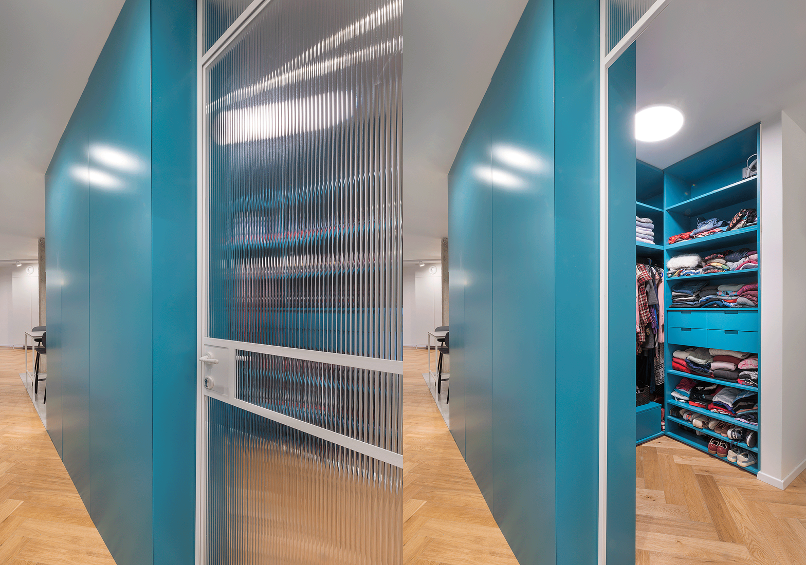
The core of the home is arranged around this element. It contains the cooking and entertaining area, and ends with a walk-in closet next to the master bedroom.

_j.jpg)
The kitchen Island - A middle ground between Elengance and functionality
Kitchen islands tend to go to the extreme: either they are fine and elegant, but then they can't contain heavy equipment such as a sink and a dishwasher (which require electricity and plumbing, going all the way down to the floor), or they are too wide and dominant (exactly to serve these systems) but then they take over the entire space.
We chose a fine and elegant compromise: an island that is slightly deeper than a standard dishwasher. This way, its opaque parts go all the way down to the floor, while the countertop goes past them, supported by thin, white steel profiles which allow to see through them, serving as dining space for six people. The unique depth and the uncluttered dining area give this piece of furniture an airy feel, contributing to the sense of continuity in the space (exactly because you can see through it).
A hidden electricity outlet at the center of the island allows to use it also as a work station.
Perceived Density
When we first stepped into the apartment our pupils dilated: it was dark, and we really felt that it was closing in on us. There was no flow of light and air, and at no point was it possible to experience the true size of the space, due to the division into tiny rooms.
Breaking down the walls allowed us a long look (XS Language) from the doorway all the way to the back yard. Now the light, air, and view crossed through the apartment.
As you step in, the look is drawn further, getting a glimpse of the garden at the edge of the apartment. The space feels roomier. In fact, it is possible to get a side-to-side view from nearly every point in the common space.
_j.jpg)
_.jpg)
_j.jpg)
_.jpg)
Delineate, Don't Separate
We can delineate the different areas in the home using a host of techniques, not just by building conventional walls.
The smooth concrete floor in the kitchen ignores the oblique element, taking in the exposed concrete pillar, and draws a rectangular area which indicates the edges of the cooking and dining area.
_.jpg)
Empty Movement (Compactness Index)
With the price per square meter increasing, we still see long hallways in many apartments, wasting away expensive floor space. These hallways serve one single purpose: movement. With no added value such as storage or other activities.
Therefore we always ask ourselves: how can we use more floor space in the apartment to serve a particular purpose? In this project, empty movement was cut in half, increasing the size of the cooking and dining area.
_j.jpg)

A Place to Do Laundry
The original laundry area completely blocked one of the most promising windows in the home, facing an unused back yard. And besides, who wants to fold laundry alone in a dark, stuffy room?
We created a pleasant, well-ventilated space at the end of the diagonal element that is dedicated for laundry. It remained close to the yard where laundry is hung to dry, while keeping it hidden from guests.
The garden was landscaped, and the dark shutters were replaced with floor-to-ceiling glass windows, bringing the outdoors into the apartment.
We placed the washing machines side-by-side, allowing to place a laundry folding counter on top of them, as well as an easily-accessible cabinet for laundry supplies. We placed lighting fixtures inside the furniture in order to avoid a situation where a lighting fixture in the center of the room casts a shade on the folding counter.
_.jpg)

Master Bedroom
When we conduct our first interview with residents, we try to place them on an exposure scale, determining their preference from airiness to complete privacy.
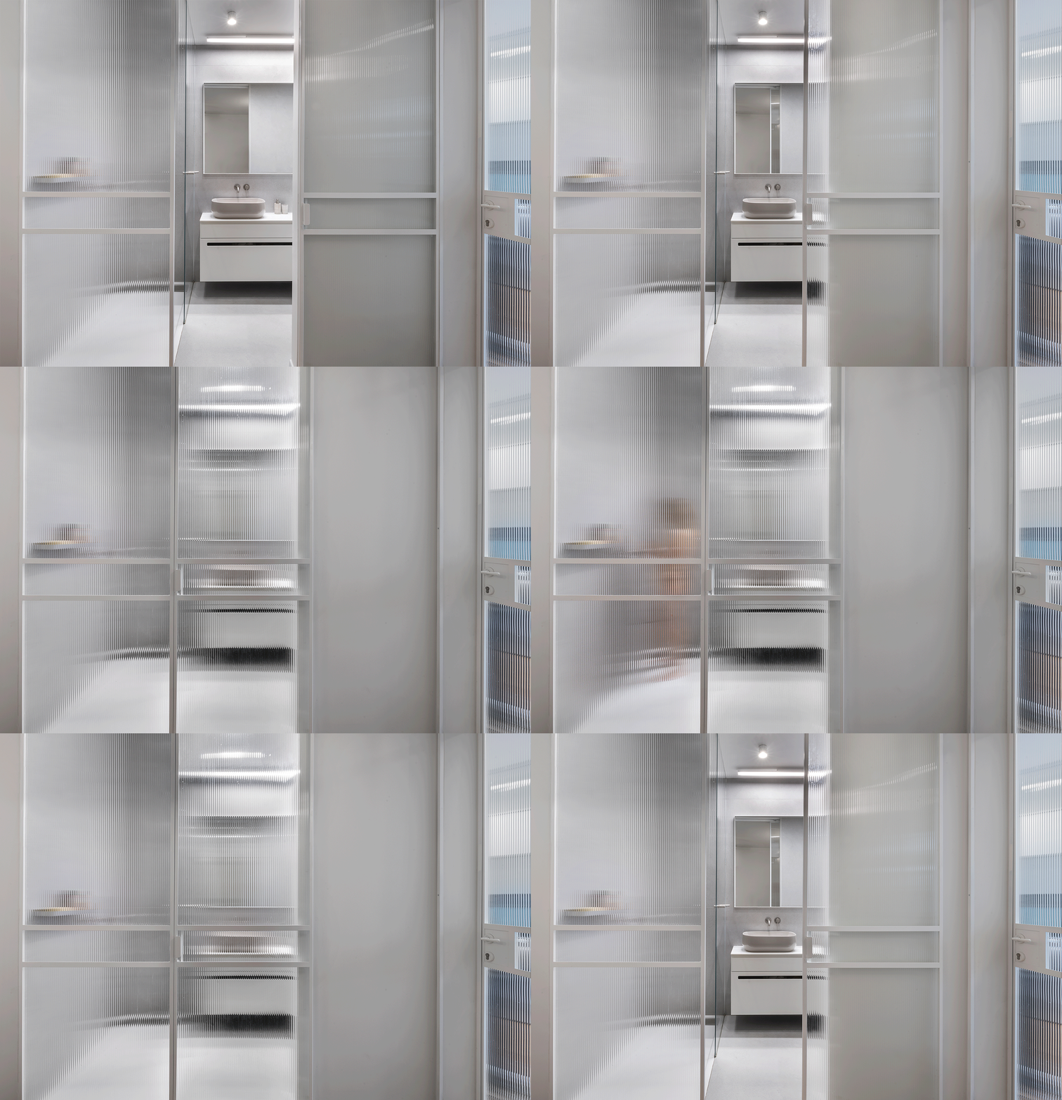
The glazed doors in the master bedroom and bathroom express their preference for transparency and openness.
The delicate striped glaze offers a hint of what’s behind it without revealing anything, allowing for a feeling of openness alongside privacy.

Sorting Through Laundry
Another passion of ours is to investigate residents' laundry habits :) Here our clients asked for four compartments. Why? Because that's the way they like it.
_.jpg)
_.jpg)
Musing on Bathrooms [1]: Oh, the Shower Pan!
Most homeowners we come across steer clear of shower pans. This is likely because they think of those of years past, a low-grade, fragile, dirty item they would most often see in their grandmother's home. An item never used for actual showers, usually made of grey terrazzo that didn’t aged well.
But there is no real reason for this aversion. Just like in the case of a toilet or a sink, a shower pan has been designed by a product designer to serve its exact purpose. The shower pan lets residents shower on a non-slip surface, with optimal inclines for drainage. Sometimes, it is simply better than the tiled showers we have grown accustomed to, where the tiling contractor cuts the tiles we have chosen in countless angles to form the appropriate incline, places them around the shower drain, and seals any gaps to the best of their ability.
_.jpg)
_.jpg)
_.jpg)
Musing on Bathrooms [2]: Taps
We at XS have a special passion for taps coming out of the wall. We prefer them to those coming out of the sink surface. Why?
[1] They don't accumulate dirt around the edges.
[2] They take up less space, allowing us to place the sink closer to the wall, or simply create a more spacious surface.
Musing on Metal Fixtures: Handles
Rather than choosing a handle off a catalog, we designed a simple, welded steel handle which would fit the door well.
Pink is Not Even a Question
One last convention we wanted to do away with in this apartment is bathroom tiles. Contractors like to stop tiling once they've reached exactly 2.10 meters above the floor, leaving a strip of plastered wall which doesn't contribute to the design and makes the space feel lower in height. This convention can be used in damp rooms with a ventilation problem, where the plaster serves as a "sponge" of sorts for excess humidity. But here the space is well ventilated with a big window.
So if every other room in this home had its walls painted floor-to-ceiling, why not do the same with the bathroom tiles for a perfect result? Certainly when pink tiles are concerned ;)
_.jpg)

